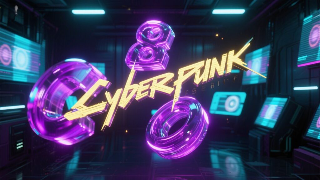
The Intro Hook
Bro, you ever looked at a text on a screen and thought… damn, yeh toh zinda hai? Like, literally alive? That’s 3D typography and motion text for you — letters that don’t just sit there like lazy PDF fonts, they move, twist, shine, and sometimes do backflips like they just got into gymnastics school. I swear, jab main ne pehli baar yeh dekha, I thought it’s magic. But like all “magic,” it’s actually just hard, sweaty work — and me crying at my desk because my text kept looking like a melted biscuit.
How I Fell Into This Madness
So, story time. I was designing a poster, right? Thought I’d be fancy and put some “3D effect” on the heading. Google pe “3D text Photoshop” search mara and got these shiny tutorials where everything looked too easy. They were like, “Just extrude your text and add a light source.” Sounds simple na? Bro, meri toh 4 ghante lag gaye sirf ye samajhne main ke light source actually kahan rakha jata hai.
And the worst part? My text ended up looking like some horror movie title from 2009. Matlab, you know that cheap glow with random drop shadows? Yeah… that. That’s when I realized — 3D typography is not just clicking buttons. It’s like sculpting, but your clay is digital letters and your tools are making you cry.
The Learning Curve (aka My Pain Chart)
Let me tell you, motion text is like teaching a stubborn cat to dance. You think it’s going to listen? Nope. It will glitch, lag, and move like it’s drunk.
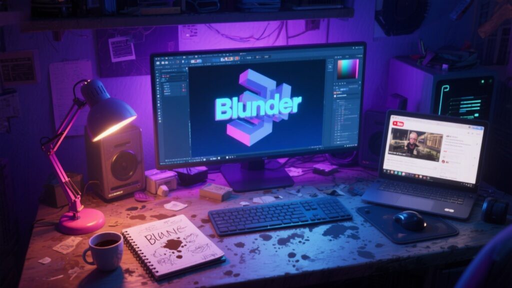
I started with Blender because free cheez ka charm alag hota hai. Watched a “Beginner’s 3D Text Animation in Blender” video. 15 minutes in, I’m like, “Oh this is so fun!” 30 minutes in, my PC fans are screaming, Blender crashes, and my chai is cold.
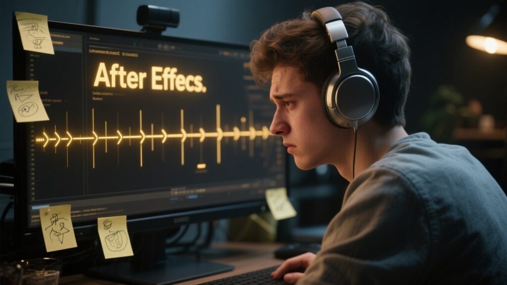
Then I tried After Effects — the “motion text king.” Bro, the amount of keyframes I had to make just to get one smooth bounce… insane. And don’t even start with easing. Pehle toh mujhe laga easing is like “take it easy,” but nah, it’s this whole science of making movement look natural.
Why 3D Typography Feels So… Different

See, normal text design is like dressing your letters up — change their clothes, give them colors, maybe some shadows. 3D typography? It’s like taking those letters to the gym, giving them muscles, making them dance in a music video. It’s immersive.
Motion text adds emotions. Like, agar aap ka title “Explosion” hai and you animate it so it actually bursts apart, woh impact alag lagta hai. It’s storytelling with just… letters.
Aur mujhe pata hai ye thoda filmy lagta hai, but motion text has this ability to make a viewer FEEL something without saying much. Bas ek smooth move ya ek dramatic pause, and boom — audience is hooked.
My Dumb Mistakes (Learn From Them, Please)
One time, I made this fancy rotating 3D text for a client. Everything was perfect… except I forgot to check the render settings. Final video aaya toh edges were jagged like saw teeth. Client ka reaction? “It looks… crunchy.” CRUNCHY, bro. My heart broke.
Another time, I thought adding like 15 effects would make it look “cool.” Nope. It looked like a Bollywood intro from the 90s. Sometimes less is more, but you only learn this after ruining at least 3 projects.
Where I Actually Learned Stuff That Worked
Now, since I don’t wanna gatekeep, yahan kuch real external links hain jo meri zindagi bachaye:
- Blender Guru’s Text Animation Tutorials – https://www.blenderguru.com
- School of Motion’s Kinetic Typography Guide – https://www.schoolofmotion.com
- Motion Design School (paid, but worth it) – https://motiondesign.school
- YouTube Gems like Ben Marriott – https://www.youtube.com/c/BenMarriott
The Mindset Shift That Saved Me
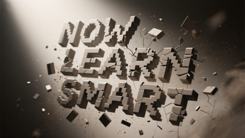
Pehle main bas effect ke peeche bhagta tha. Like, “Oh yeh shiny text bana leta hoon, that’s enough.” But 3D typography and motion text is not about throwing random effects — it’s about rhythm, timing, and purpose. Har movement ka reason hota hai. If your text spins, WHY is it spinning? If it pops, WHY at that exact beat?
Jab yeh samajh aaya, my work improved 10x. Ab main pehle plan banata hoon, storyboard type. Phir I choose colors, lighting, camera angles. Bas phir detailing ka kaam hota hai.
The “Oh Damn” Moment
One night, I was doing this promo animation for a friend’s channel. We were on a Discord call, both sleepy, it’s like 2:30am. I finally got the bounce just right. We hit play, and bro… the letters moved exactly with the beat drop. We both screamed. That’s the “hooked for life” moment for me.
If You’re Starting, Here’s My Honest Advice

You will suck at first. Matlab, really bad. And that’s fine. Every ugly text you make is one step closer to making something that makes people go “woah.” Don’t get stuck on one software — try Blender, Cinema 4D, After Effects, even Canva’s basic animations if you’re broke. Learn movement principles — slow in, slow out, overshoot, follow through. Yeh filmy lagta hai but it works.
And for the love of chai, don’t overload effects. Give your text space to breathe. Let it talk.
Anyway, I could keep going but meri chai ab bilkul thandi ho gayi and my GPU is giving me dirty looks. If you’re into 3D typography and motion text, just know — it’s going to break your patience before it pays you back. But jab woh perfect move ban jata hai, it feels like hitting that last level in a game you’ve been stuck at for months.
So yeah. Good luck. And if your text ends up looking crunchy, just call it “retro style.” Trust me, kaam ban jayega.
Contact us
Stay Safe, Stay Real Peace 💕